Healthcare · AI
Evolution of the Oral Cancer Screening App
Aarogya Aarohan — an AI-powered oral cancer screening app for frontline health workers, designed to enable early detection across underserved communities in rural India.
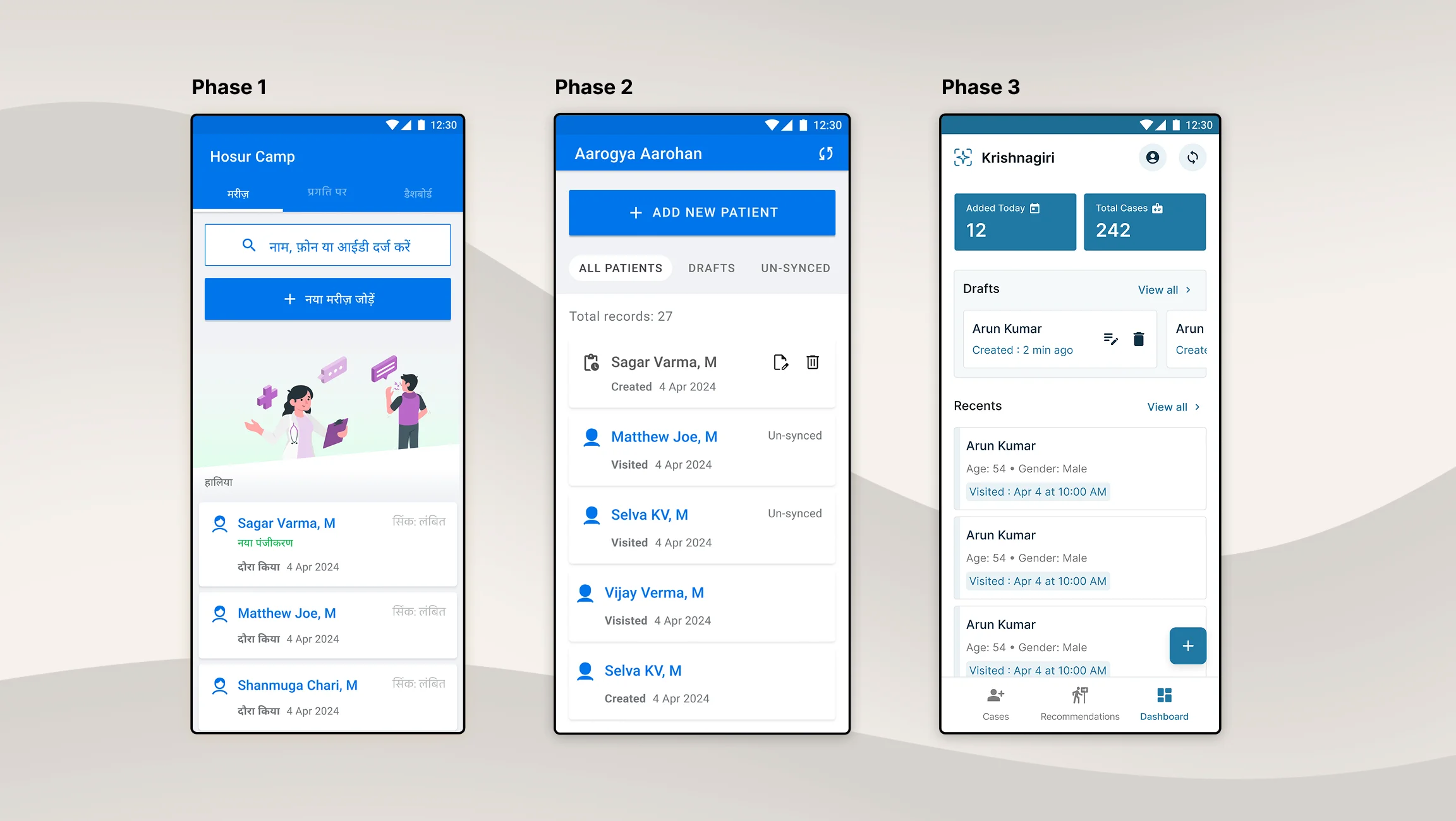
The Problem
52,000 Deaths a Year, Most of Them Preventable
India has one of the highest oral cancer burdens in the world — 77,000 new cases and 52,000 deaths annually. Most are diagnosed too late, when treatment options narrow and survival rates drop.
The reasons compound: rural areas lack healthcare infrastructure, awareness is low, and habits like tobacco use are widespread. But the central issue IISc identified was simple — there was no mechanism for early detection at scale.
To address this, IISc organised screening camps in rural and remote areas. The screeners would be ASHA health workers — frontline community workers with no clinical training. They needed a tool that could guide them through the screening process and use AI to flag potential cases. That tool became Aarogya Aarohan.
The Context
Government-Backed, Research-Driven
Aarogya Aarohan is part of AI-COE (Artificial Intelligence — Centre of Excellence), an Indian government initiative to apply AI for public good. The project was sponsored by IISc and Niti Aayog, governed by ICMR, and built by our team at Triveous.
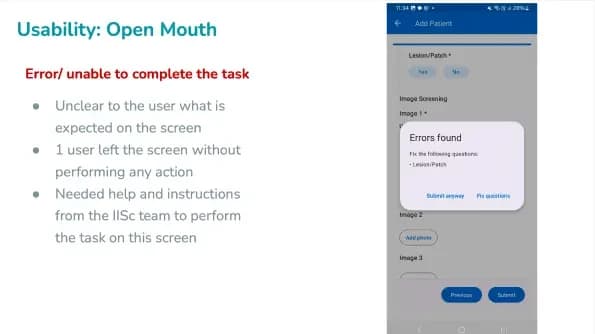
I joined after the first phase had shipped and been pilot-tested at AIIMS Delhi with ASHA workers and nurses. The usability testing surfaced real problems — and solving them became my responsibility across the next two design phases.
My scope: analysing field research insights, redesigning the interface, improving core workflows, and building a design system purpose-built for low-end Android devices.
Understanding the Users
Designing for the Hardest Constraints
The Delhi pilot revealed who we were really designing for — and the constraints were severe.
ASHA workers use their own phones. No employer-issued devices, no standardised hardware. Phones costing ₹6,000 to ₹15,000, mostly Android, with batteries lasting 3–4 hours under load. No electricity at screening sites. Their own 4G/5G data plans.
When a call came in mid-screening, the app crashed. The worker had to restart the entire process from scratch — re-entering patient details, retaking photos, re-running the AI inference. In a camp setting with dozens of patients waiting, that wasn't just frustrating — it meant people went unscreened.
The other problem was sync visibility. The app worked offline-first, but workers couldn't tell which cases had synced to the server and which hadn't. Unsynced data on a phone with a dying battery is data at risk of being lost entirely.
Solving Data Loss
Draft-Save and Sync Segregation
Two design decisions addressed the core usability failures.
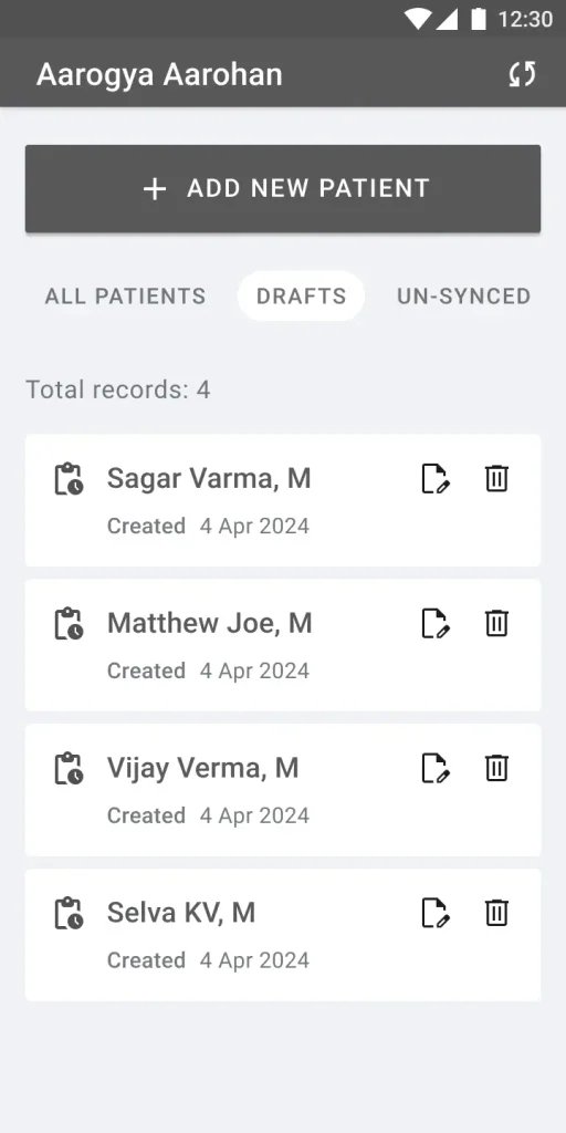
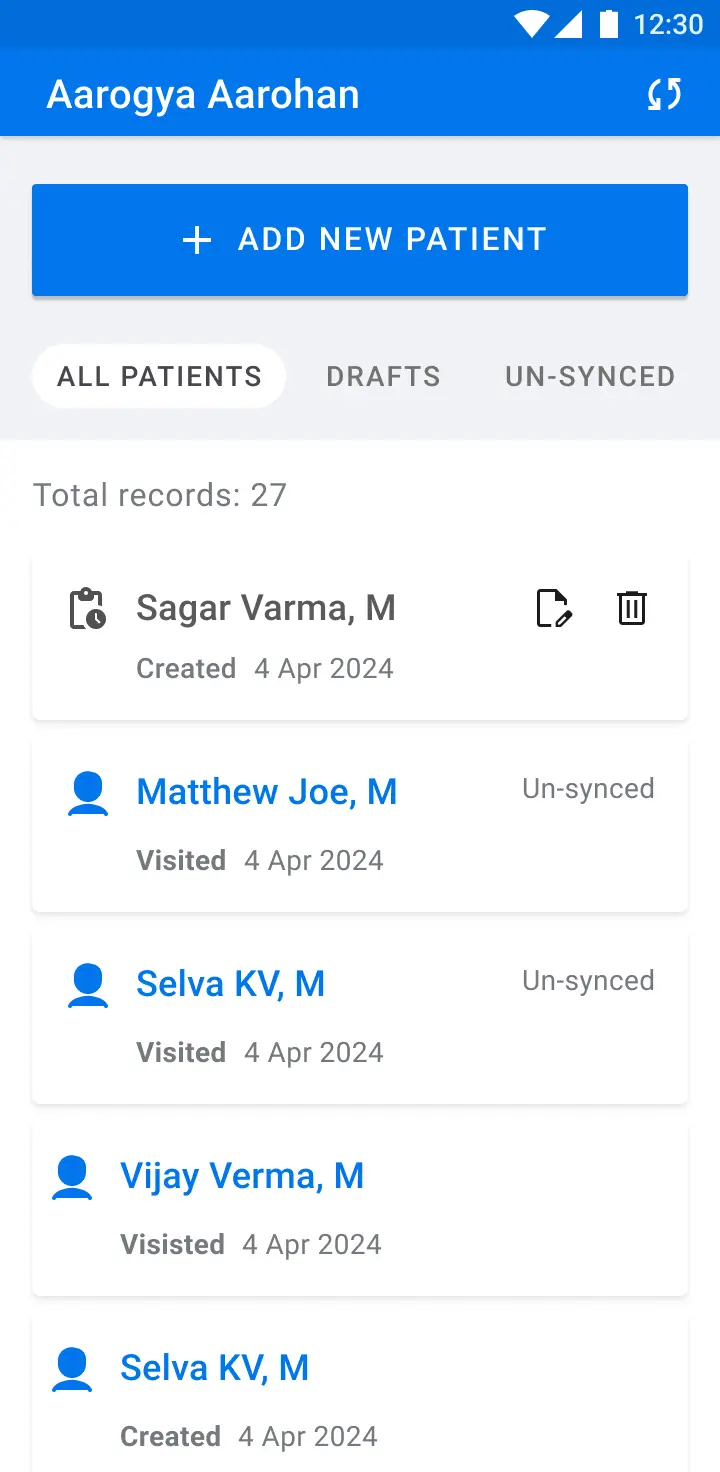
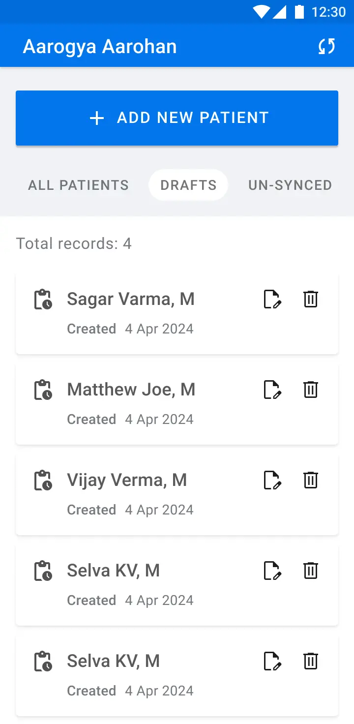
First, a draft-save mechanism. If a screening was interrupted — by a phone call, a battery warning, anything — the app preserved the incomplete session automatically. Workers could pick up exactly where they left off. No re-entry, no lost photos, no repeated AI inference.
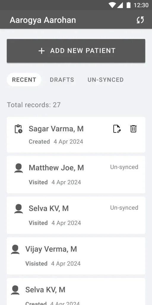
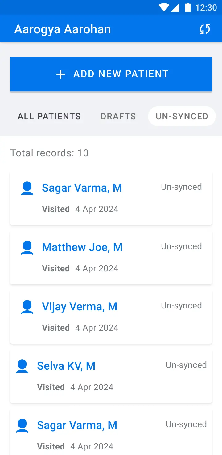
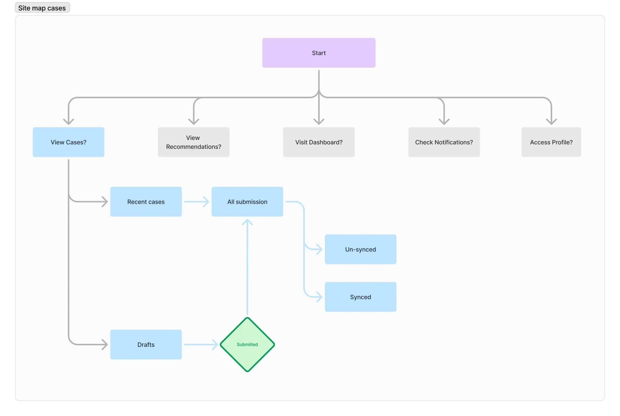
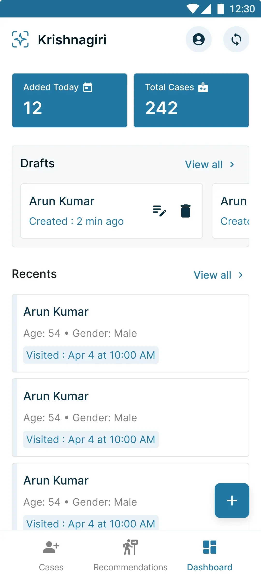
Second, clear sync segregation. I separated synced and unsynced cases visually, with distinct sections and a manual sync button in the top app bar. Workers could scan the list at a glance, see how many cases were waiting to upload, and trigger sync when connectivity allowed.
I explored multiple layout options, evaluated each for usability on small screens and feasibility with the engineering team, then moved from wireframes to high-fidelity screens with detailed technical guidelines. Explaining offline-first and draft persistence to engineers required multiple sessions — the behaviour was non-trivial to implement correctly.
Swipe or use arrows to browse
First Iteration
Shipping Stability
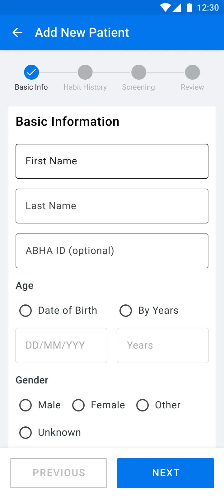
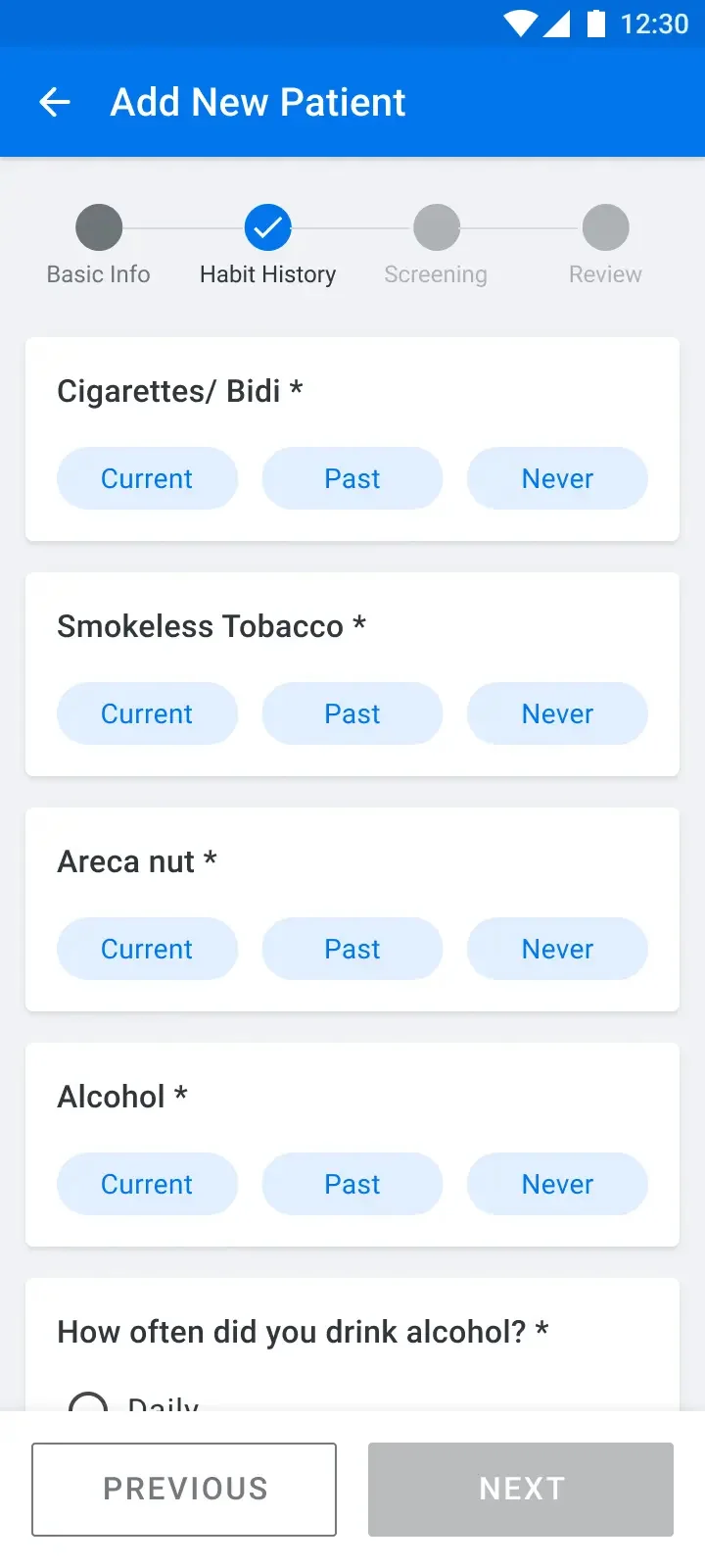
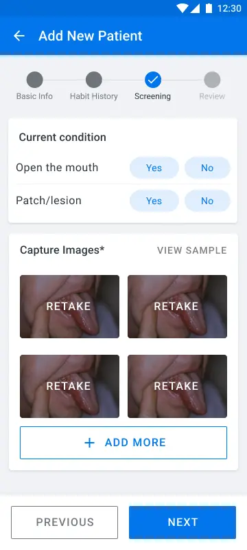
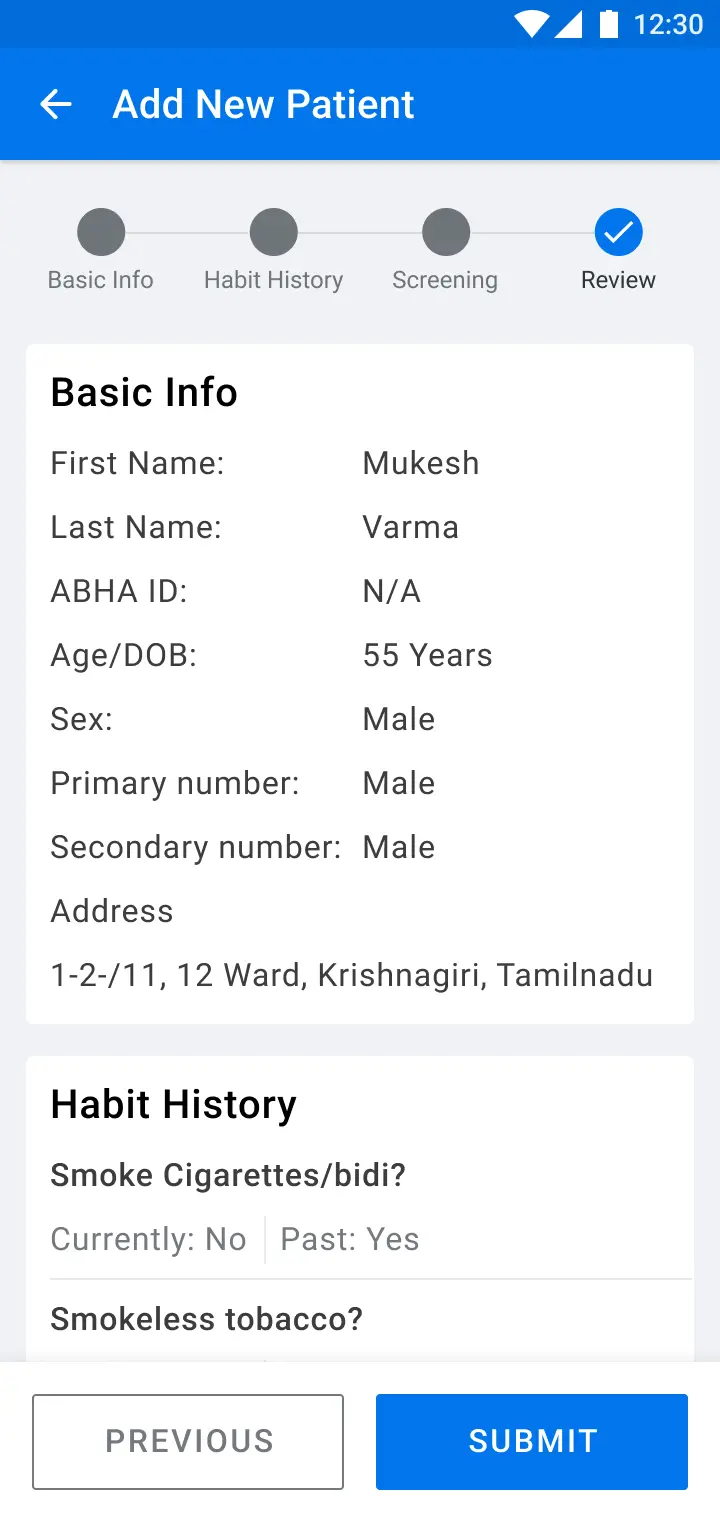
The first redesign focused on trust and reliability. Drafts and synced cases lived in separate tabs. Navigation stayed flat — no nested screens, no buried actions. Everything a worker needed was one tap away.
The aim was to show everything upfront and avoid complexity inside the app. For workers with limited tech literacy operating in high-pressure camp environments, every extra tap is a point of failure.
Swipe or use arrows to browse
Refined Screens
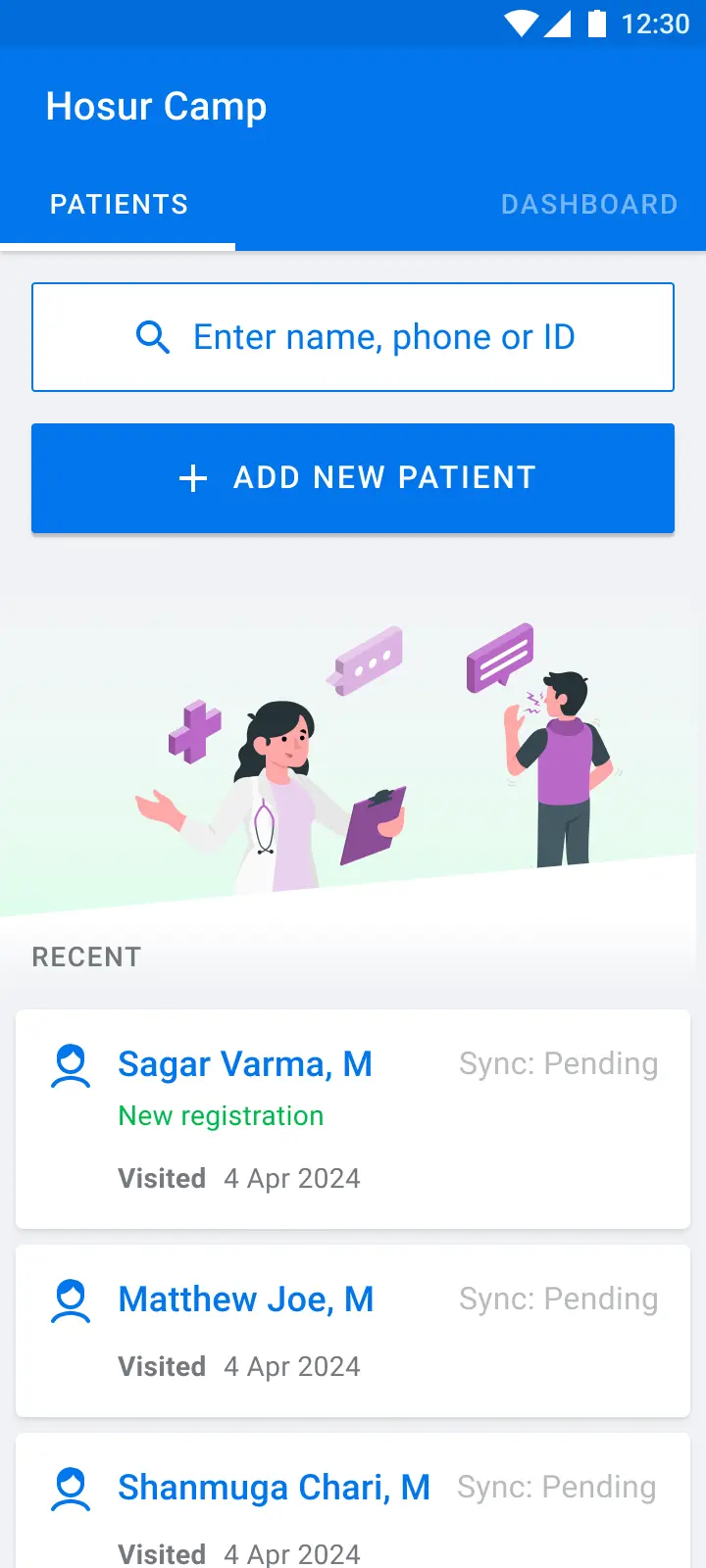
After reviews with the team, I tightened the hi-fi screens and handed them to engineering with clear guidelines on draft persistence and offline sync behaviour.
Swipe or use arrows to browse
Field Research — Krishnagiri
Testing in Rural Tamil Nadu
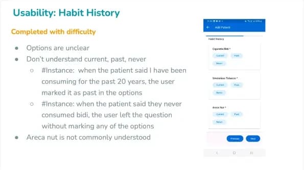
The Delhi pilot was a starting point, not a conclusion. To understand how the app performed in the conditions it was actually built for, the IISc team organised two screening camps in rural Krishnagiri, Tamil Nadu — one in Mallapadi and one in Kanthikuppam, with support from the state government.
A Product Designer from Triveous and an IISc researcher conducted on-site observation at Mallapadi. I analysed the research findings remotely to inform the next design iteration.
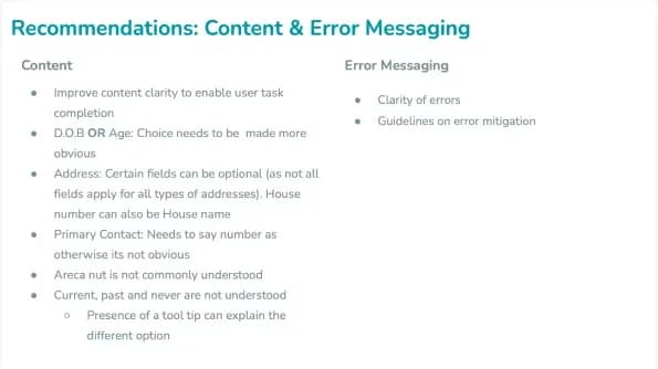
The insights from Krishnagiri changed the direction of the project. The existing layout couldn't support the features workers actually needed — follow-up tracking, a dashboard for camp progress, notifications, and profile management. Patching the current design wasn't an option.
Redesigning the Architecture
Starting from Scratch
The field research made it clear: the app needed a ground-up redesign, not incremental fixes.
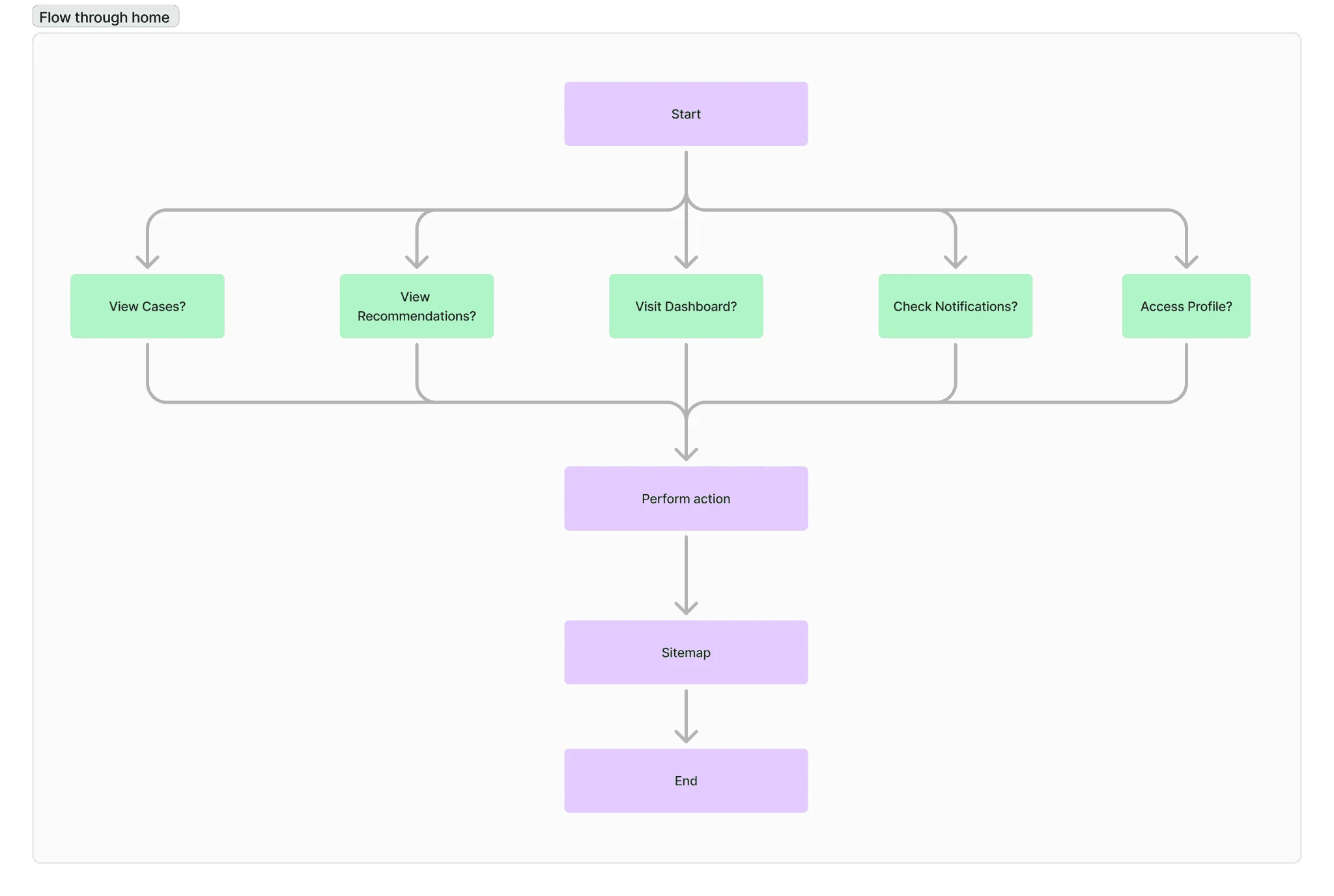
I rebuilt the information architecture and sitemap from scratch to accommodate the new features — Dashboard, Cases, Tasks, Profile, and Notifications — while keeping the core screening flow intact. Daily huddles with the IISc team in Bangalore, who were running parallel usability research, kept the design aligned with incoming findings.
For the design system, we moved away from ad-hoc components and built a purpose-built system using Material Design as the foundation — optimised for the low-end Android devices ASHA workers actually used. For the backend admin panels, we continued with Carbon Design System, which we were already using for MIDAS.
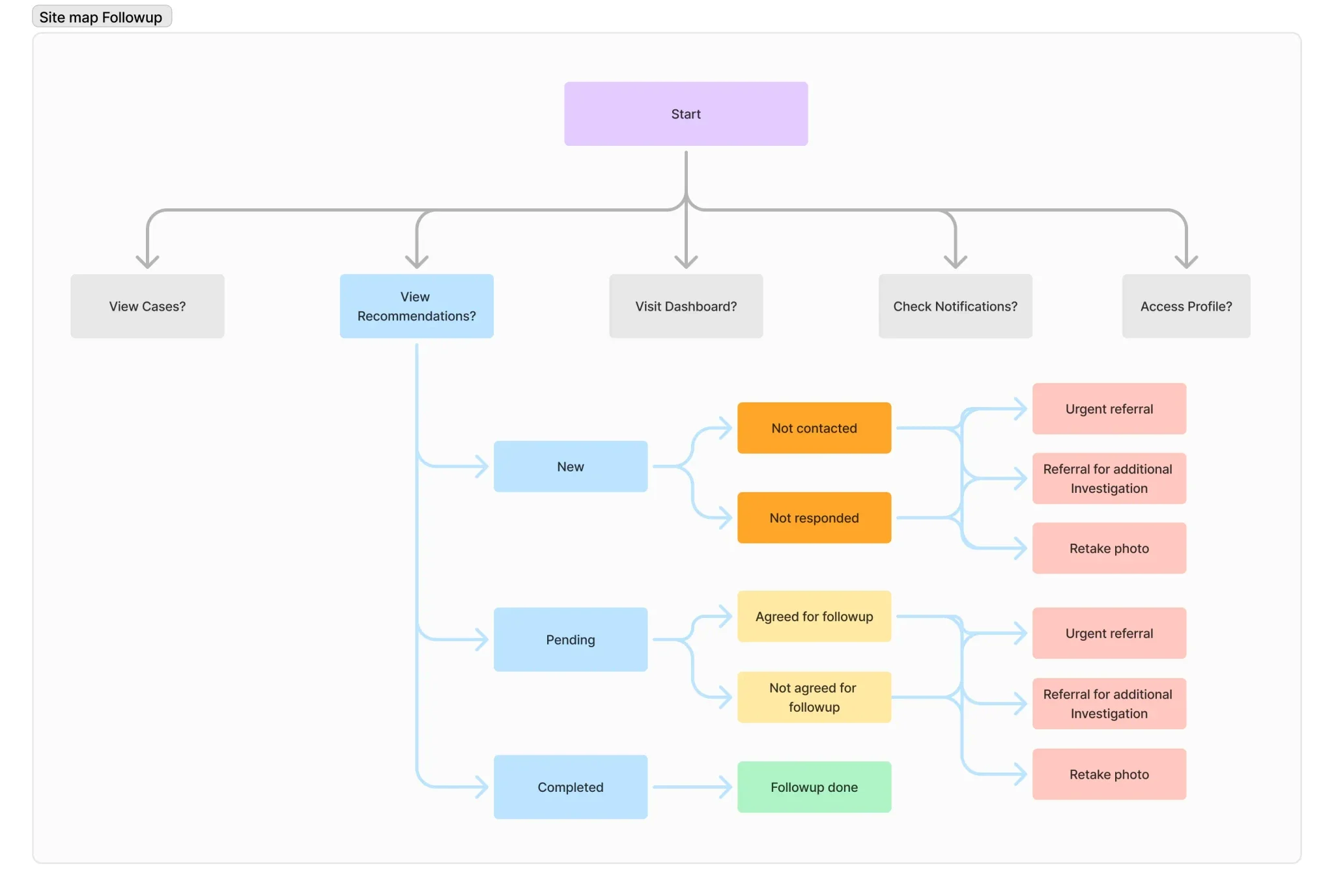
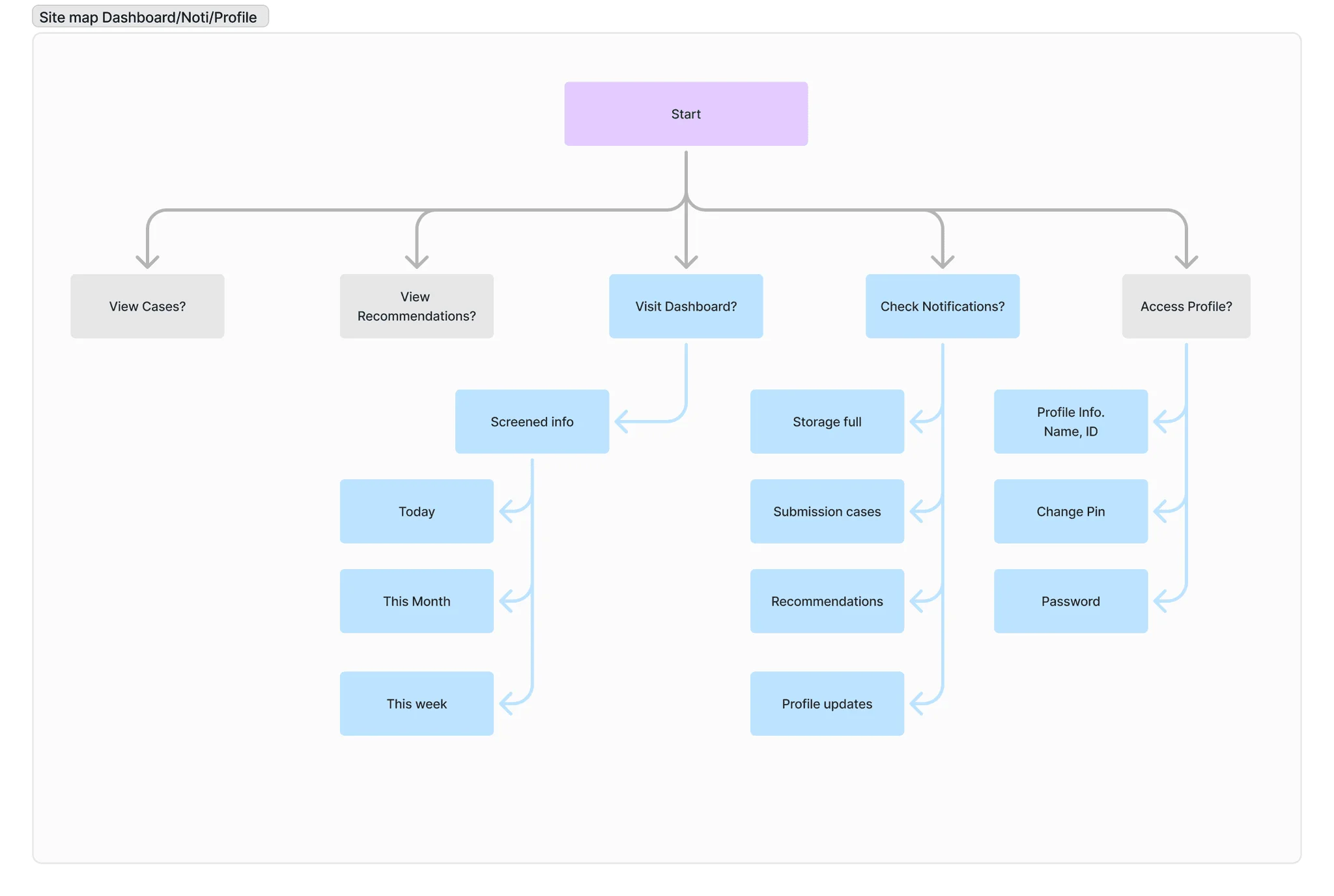
Swipe or use arrows to browse
From Wireframes to Final Screens
I worked through multiple rounds of sketches and lo-fi wireframes before moving to high fidelity. The final screens reflected everything we'd learned — from the Delhi pilot, the Krishnagiri camps, and ongoing IISc research.
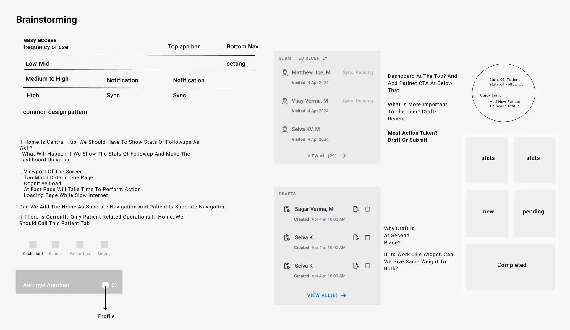
The Final Product
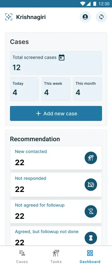
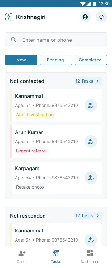
Three core surfaces — a dashboard for camp-level progress and follow-up tasks, a cases screen separating drafts from submitted and synced screenings, and a tasks section for tracking new, pending, and completed follow-ups.
Dashboard — screening stats and follow-up tasks at a glance
Cases — drafts, recent submissions, and synced screenings
Tasks — new, pending, and completed follow-ups
Impact
Aarogya Aarohan replaced a fully manual, paper-based screening process. ASHA workers now complete screenings faster with AI-inferred results generated instantly. The draft-save mechanism eliminated data loss from phone interruptions — a problem that previously forced workers to restart entire screenings.
The app is deployed across 5 states — Karnataka, Tamil Nadu, Delhi, Assam, and Uttar Pradesh — with hundreds of active ASHA workers using it daily.
Key outcomes:
- ◆5 states, hundreds of ASHA workers onboarded
- ◆3 design phases shipped in 12 weeks
- ◆Offline-first architecture serving areas with zero connectivity
- ◆Custom design system built for low-end Android devices (₹6K–15K range)
- ◆Presented at the G20 Summit, recognised by AIIMS Delhi and ICMR
Research continues with primary users. The team is expanding to more rural districts and refining the AI model with data from MIDAS.